40.3. Point estimates and credible regions#
We will use PDFs to quantify the strength of our inference processes. However, one might be in a situation where it is desirable to summarize the information contained in a PDF in a single (or a few) numbers. This is not always easy, but some common choices are listed here.
Mean, median, mode#
The values of the mode, mean, and median can all be used as point estimates for the “most probable” value of \(X\). The mode is the position of the peak of the PDF, the mean was defined in Eq. (39.22), while the median is the value \(\mu_{1/2}\) for which \(P(\mu_{1/2}) = 0.5\). For some PDFs, these metrics will all be the same as exemplified in the first and last panel of Fig. 40.1. For others, such as exemplified in the middle panel, they will not.
Let us consider three example PDFs that illustrate some of the features of the different point estimates and the problems that might occur.
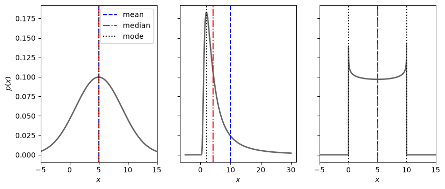
Fig. 40.1 The mean, median and modes(s) for some exampls PDFs. For some PDFs, several or all of these metrics are the same. For others they are not. The position of the mean is largely affected by long tails as illustrated in the middle panel. The PDF in the right panel has two modes (it is bimodal). Although no shuch example is shown here, there are PDFs for which the mean is not defined.#
Discuss
Which point estimate do you consider most representative for the different PDFs?
Credible regions#
The integration of the PDF over some domain translates into a probability. It is therefore possible to identify regions \(\mathbb{D}_P\) for which the integrated probability equals some desired value \(P\), i.e.,
This allows to make statements such as: “There is a 50% probability that the parameters are found within the domain \(\mathbb{D}_{0.5}\)””. However, the identification of such a domain is not unique. Two popular choices are
Highest-density regions (HDR)
The HDR is the smallest possible domain that gives the desired probability mass. That is
(40.7)#\[\begin{equation} p(\boldsymbol{x}) \geq p(\boldsymbol{y}), \quad \text{when } \boldsymbol{x} \in \mathbb{D}_P \text{ and } \boldsymbol{y} \notin \mathbb{D}_P. \end{equation}\]Equal-tailed interval (ETI)
For a univariate PDF we can define an interval \([a,b]\) such that \(\int_a^b p(x) dx = P\) and the probability mass on either side (the tails) are equal. The end points of this ETI fulfil
(40.8)#\[\begin{equation} P(a) = 1-P(b) = \frac{1-P}{2}. \end{equation}\]
Discuss
How would you describe a multimodal PDF using these metrics?
Let us again consider the three example PDFs from above.
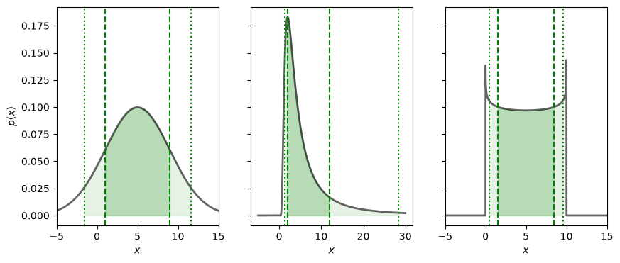
Fig. 40.2 The 68/90 percent credible regions of some example PDFs are shown in dark/light shading. These are all equal-tailed intervals.#
Let us also look at a multivariate PDF. The example below is a bivariate normal distribution with non-zero off-diagonal covariance. It is represented by a so called corner plot of a large number of samples. The bivariate distribution is shown in the lower left panel, while the two marginal ones are shown on the diagonal.
mean=[0.5,1]
cov = np.array([[1,-1],[-1,4]])
my_multinorm_rv=stats.multivariate_normal(mean=mean,cov=cov)
x1x2=my_multinorm_rv.rvs(size=100000)

# We use the prettyplease package from
# https://github.com/svisak/prettyplease
import sys
import os

import prettyplease as pp

fig_x1x2 = pp.corner(x1x2, bins=50, labels=[r'$x_1$',r'$x_2$'],
                          quantiles=[0.16, 0.84], levels=(0.68,0.9),linewidth=1.0,
                          plot_estimates=True, colors='green', n_uncertainty_digits=2,
                          title_loc='center', figsize=(5,5))
glue("bivariate_fig", fig_x1x2, display=False)
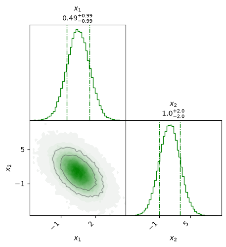
Fig. 40.3 A corner plot of a bivariate normal PDF. The 68% and 90% credible regions are indicated by level curves in the lower left panel. Note the anti-correlation between the two variables (the correlation coefficient is \(\rho_{12}=-0.5\)). The marginal distributions for \(x_1\) and \(x_2\) are shown in the diagonal panels with the dashed lines indicating the corresponding 68% credible intervals. Note that the marginal PDFs are univariate normal distributions.#