
8.6. The bias-variance trade-off#
In the first three sections we’ll use a fixed linear regression example to illustrate overfitting and underfitting, the bias-variance trade-off, and ridge regression. (See Section 25.3 for more details on these concepts.) Then in the final section you can play with a widget to explore all three!
Overfitting and underfitting#
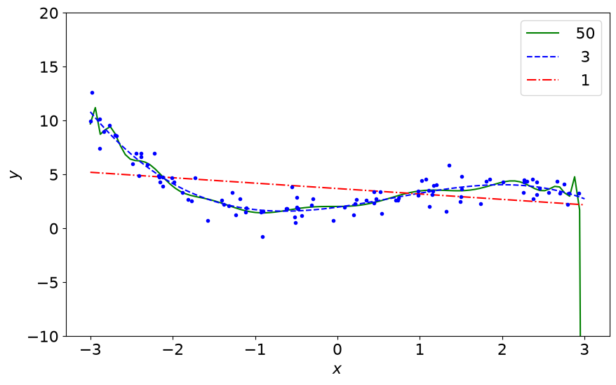
Let us consider some data generated from a cubic polynomial plus some random (Gaussian) noise. These are the blue dots in the figure below (error bars not shown). We apply linear regression with three models: polynomials of order 1, order 3, and order 50.
order  50: rms parameter size =  7.3e+02
order   3: rms parameter size =  1.2e+00
order   1: rms parameter size =  3.0e-01
Observations:
Note how the high-degree polynomial produces a very wiggly curve that tries very hard to go through the training data. The model explodes near the edges where there is no more training data. This is overfitting. A symptom of overfitting is that the size of the fit parameters can get very large.
The first degree polynomial, in contrast, fails to pick up some trends in the data that are clearly there (despite the noise). This is underfitting. The model is not complex enough.
A concise definition of overfitting and underfitting (source unknown):
A model overfits if it fits noise as much as data and underfits if it considers variability in data to be noise while it is actually not.
Bias-variance trade-off#
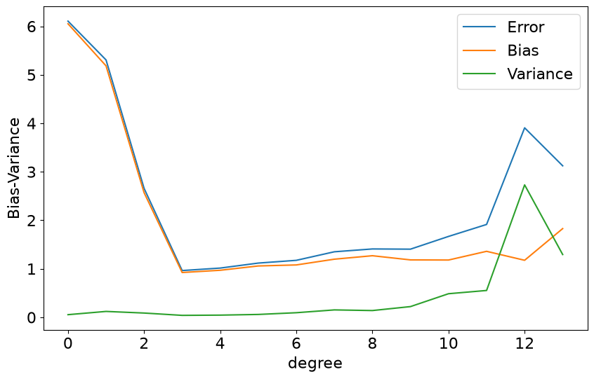
An underfit model has a high bias, which means that it gives a rather poor fit and the error (as a function of \(x\) here) will be rather large in average. An overfit model will depend sensitively on the data used for the fit. A different set of (random) data will give very different predictions if the model is overfit. We therefore say that the model displays a high variance. While the overfit model usually reproduces training data very well (low bias), it does not generalize well and gives a poor reproduction of new data points.
Ridge regression#
Generally overfitting is characterized by large fit parameters, so we can attempt to avoid overfitting by regularizing the model parameters. Ridge regression assigns a penalty function that discourages overly large parameters. Larger \(\lambda\) in the figures below means a larger penalty. See Section 25.3 for further details.

Widget time!#
This interactive widget illustrates one of the central ideas in statistical learning: the bias–variance trade-off. It combines repeated Monte Carlo simulations with polynomial regression to show how increasing model complexity affects prediction error.
The widget has two complementary panels:
The upper panel shows how the expected prediction error changes with model complexity (here the complexity is the degree of the polynomial). The plotted curves are estimated from repeated simulations. Throughout, \(f(x)\) denotes the true function generating the data, while \(\hat f(x)\) denotes the function estimated from a single noisy training set. Repeating the experiment produces a different estimate, whose variability gives rise to the bias–variance decomposition.
The blue curve shows the squared bias,
\[ \text{bias}^2(x) = \Bigl(\mathbb{E}[\hat f(x)] - f(x)\Bigr)^2 \]averaged over the independently generated noisy training sets. The bias measures the systematic error caused by an insufficiently flexible model; it usually decreases as model complexity increases.
The red curve shows the variance of \(\hat f(x)\), again averaged over the training sets. Variance measures how much the fitted model changes when a different noisy training set is observed. Variance usually increases with complexity.
The green curve is
\[ \text{Bias}^2 + \text{Variance} , \]which approximates the expected test mean-squared error. Its minimum identifies the best compromise between underfitting and overfitting. If one instead measured prediction error on future noisy observations, an additional irreducible noise term \(\sigma^2_{\text{noise}}\) would be added.
The blue shaded region indicates the underfitting side of the optimum; red shading indicates the overfitting side. The boundaries move as the simulation parameters change.
The dashed vertical line indicates the polynomial degree with the smallest estimated prediction error. Changing sample size, observational noise, regularization or underlying function may cause this optimum to move.
The lower panel illustrates the statistical origin of bias and variance. It explains why those changes occur by displaying many fitted models obtained from different noisy training sets (a representative subset of all Repetitions is shown). The bias–variance calculations themselves continue to use all Monte Carlo repetitions.
Each thin light blue curve is the polynomial obtained from one independently generated noisy training set. The spread of these curves is the visual manifestation of variance.
The thick blue curve is the average prediction, \(\mathbb{E}[\hat f(x)]\), computed over all simulated training sets. Its deviation from the true function represents the bias.
The thick black curve is the true underlying function from which the synthetic data are generated.
The red points are one representative noisy training set. They illustrate the data that one individual fit is attempting to explain.
Widget user interface features:
Click the three-horizontal-line-icon at top to expand widget display;
select the true underlying function using the pulldown;
data sliders select: no. of noisy training points for each simulated data set (samples); noise level \(\sigma\) for the random samples;
the Repetitions slider determines how many independent training sets are generated. Each repetition samples a new noisy data set, fits every polynomial degree, then predicts the function on a dense grid. These repeated simulations are averaged to estimate bias, variance, and expected prediction error. Increasing the number of repetitions produces smoother and more stable estimates.
sliders to select settings for the Bias-variance graph: maximum degree displayed; log, linear, or normalized y-scale; the “selected degree” for which the bias, variance, and total error is displayed;
other sliders for true and fitted functions in lower graph: selected degree of the fitted polynomial; toggle bottom graph on and off (show fitted models);
size of ridge regression parameter \(\lambda\) (larger means more regularization);
press Resample simulation to generate new samples.
What happens when you increase the number of sampled training points?
Increasing the number of samples generally …
Answer
decreases the variance,
shifts the optimal model complexity toward larger values,
improves predictive accuracy.
What happens when you increase the noise level of each sample?
Larger observational noise will …
Answer
increase the variance,
increase the irreducible error,
favor simpler models (here that means smaller order polynomials).
The ridge slider controls the regularization parameter \(\lambda\).
Increasing ridge regularization will …
Answer
suppress large polynomial coefficients,
reduce variance,
increase bias,
often improve prediction when high-degree polynomials are used (try it!).