13.10. Student’s t-distribution from Gaussians#
Physicists often assume that most distributions are Gaussian. But sometimes they are Student’s t-distributions.
David C. Bailey, in the paper Not Normal: the uncertainties of scientific measurements, analyses 41000 measurements of 3200 quantities from medicine, nuclear and particle physics, and many interlaboratory comparisons. He finds “Uncertainty-normalized differences between multiple measurements of the same quantity are consistent with heavy-tailed Student’s t-distributions that are often almost Cauchy, far from a Gaussian Normal bell curve”.
Appendix A of Rigorous constraints on three-nucleon forces in chiral effective field theory from fast and accurate calculations of few-body observables by Wesolowski et al. (arXiv:2104.0441) explains why, in linear parameter estimation problems with variance estimation, one finds that the parameters are typically t distributed after one marginalizes over the variance.
In short, if you are uncertain of your uncertainty (variance), and being a good Bayesian you integrate over the distribution of variances, you will get a t distribution. So imagine a mixture of normal distributions with a common mean but with the precision (the inverse of the variance) distributed according to a gamma distribution (or the variance is distributed with an inverse gamma distribution). As a visualization, Rasmus Bååth in this blog entry created an animation by making draws from a normal distribution whose width (standard deviation) “jumps around”. Here we have created a version of this animation that also includes the sampling of the variance. (Note: instead of variance sampling we could have alternatively used conjugate priors.)
Preliminaries#
%matplotlib inline
import numpy as np
import matplotlib.pyplot as plt
import matplotlib as mpl
import matplotlib.cm as cm
from matplotlib import animation
import ipywidgets as widgets
from IPython.display import display, HTML
from scipy.stats import norm, t, gamma
# set up graphics defaults
from graphs_rjf import setup_rc_params
setup_rc_params(presentation=False, uselatex=False) # Switch to True for larger fonts
# Switch to True for LaTeX but SLOW
mpl.rcParams['figure.constrained_layout.use'] = False
plt.rcParams['animation.html'] = 'jshtml' # auto-inline via JS (no ffmpeg needed)
Here we define some utility functions we can use to explore the t distribution.
def dist_stuff(dist):
"""
Finds the median, mean, and 68%/95% credible intervals for the given
1-d distribution (which is an object from scipy.stats).
"""
# For x = median, mean: return x and the value of the pdf at x as a list
median = [dist.median(), dist.pdf(dist.median())]
mean = [dist.mean(), dist.pdf(dist.mean())]
# The left and right limits of the credibility interval are returned
cred68 = dist.interval(0.68)
cred95 = dist.interval(0.95)
return median, mean, cred68, cred95
def dist_mode(dist, x):
"""
Return the mode (maximum) of the 1-d distribution for array x.
"""
x_max_index = dist.pdf(x).argmax()
# Return x of the maximum and the value of the pdf at that x
mode = [x[x_max_index], dist.pdf(x[x_max_index])]
return mode
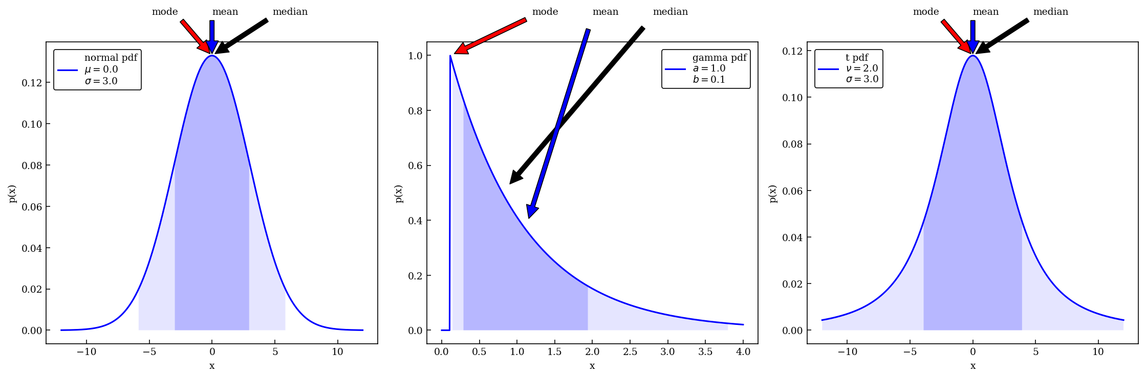
def dist_plot(ax, dist_label, x_dist, dist, color='blue'):
"""
Plot the distribution, indicating median, mean, mode
and 68%/95% probability intervals on the axis that is passed.
"""
median, mean, cred68, cred95 = dist_stuff(dist)
mode = dist_mode(dist, x_dist)
ax.plot(x_dist, dist.pdf(x_dist), label=dist_label, color=color)
ax.set_xlabel('x')
ax.set_ylabel('p(x)')
# Point to the median, mode, and mean with arrows (adjusting the spacing)
text_x = 0.2*(x_dist[-1] - x_dist[0])
text_x_mid = (x_dist[-1] + x_dist[0]) / 2.
text_y = mode[1]*1.15
ax.annotate('median', xy=median, xytext=(text_x_mid+text_x, text_y),
arrowprops=dict(facecolor='black', shrink=0.05))
ax.annotate('mode', xy=mode, xytext=(text_x_mid-text_x, text_y),
arrowprops=dict(facecolor='red', shrink=0.05))
ax.annotate('mean', xy=mean, xytext=(text_x_mid, text_y),
arrowprops=dict(facecolor='blue', shrink=0.05))
# Mark the credible intervals using shading (with appropriate alpha)
ax.fill_between(x_dist, 0, dist.pdf(x_dist),
where=((x_dist > cred68[0]) & (x_dist < cred68[1])),
facecolor='blue', alpha=0.2)
ax.fill_between(x_dist, 0, dist.pdf(x_dist),
where=((x_dist > cred95[0]) & (x_dist < cred95[1])),
facecolor='blue', alpha=0.1)
ax.legend();
Make some plots#
Pick some parameters characterizing normal (Gaussian), gamma, and t distributions, and make some plots. Note that the gamma distribution goes to zero at positive \(x\), not at \(x=0\).
# For normal distribution
mu = 0 # mean
sigma = 3 # standard deviation
# For gamma distribution
a1 = 1
b1 = 1/9
# For t distribution
t_df = 2 # degrees of freedom
t_loc = 0 # mean
t_scale = 3 # standard deviation
# Make some standard plots: normal, beta
fig = plt.figure(figsize=(15,5))
# Standard normal distribution -- try changing the mean and std. dev.
x_norm = np.linspace(-12, 12, 500)
norm_dist = norm(mu, sigma) # the normal distribution from scipy.stats
norm_label='normal pdf' + '\n' + rf'$\mu=${mu:1.1f}' \
+ '\n' + rf'$\sigma=${sigma:1.1f}'
ax1 = fig.add_subplot(1,3,1)
dist_plot(ax1, norm_label, x_norm, norm_dist)
# gamma distribution, characterized by a and b parameters
x_gamma = np.linspace(0, 4, 500) # gamma ranges from 0 to infinity
gamma_dist = gamma(a1, b1) # the beta distribution from scipy.stats
gamma_label='gamma pdf' + '\n' + rf'$a=${a1:1.1f}' \
+ '\n' + rf'$b=${b1:1.1f}'
ax2 = fig.add_subplot(1,3,2)
dist_plot(ax2, gamma_label, x_gamma, gamma_dist)
# student's t-distribution
x_t = np.linspace(-12, 12, 500)
t_dist = t(df=t_df, loc=t_loc, scale=t_scale)
t_label='t pdf' + '\n' + rf'$\nu=${t_df:1.1f}' \
+ '\n' + rf'$\sigma=${t_scale:1.1f}'
ax3 = fig.add_subplot(1,3,3)
dist_plot(ax3, t_label, x_t, t_dist)
# mu2 = gamma2_dist.mean()
# sigma2 = gamma2_dist.std()
# norm2_dist = norm(mu2, sigma2)
# ax3.plot(x_gamma, norm2_dist.pdf(x_gamma), color='red')
fig.tight_layout()
Histograms matching a t distribution#
A t distribution with mean \(\mu\), scale \(s\), and degrees of freedom \(\nu\)
can be created from
where \(\sigma\) comes from
First get 6000 draws of \(1/\sigma^2\), based on t_scale (which is \(s\)) and t_df (which is \(\nu\)).
# Student's t-distribution with particular parameters
t_loc = 0
t_scale = 3
t_df = 2 # 20 # degrees of freedom, using written with nu
t_dist = t(df=t_df, loc=t_loc, scale=t_scale)
# Now the gamma distribution, converted to a sigma distribution
N_gamma = 6000 # 500000 # 6000
gamma_a = t_df / 2
gamma_scale = 1 / (t_scale**2 * t_df / 2)
sigma_vals = 1 / np.sqrt(gamma.rvs(gamma_a, scale=gamma_scale, size=N_gamma))
# Gaussian (normal) distribution
norm_loc = t_loc
norm_scaled_vals = np.array([norm.rvs(norm_loc, sigma, size=1) for sigma in sigma_vals]).flatten()
# Check the shapes
print(sigma_vals.shape)
print(norm_scaled_vals.shape)
(6000,)
(6000,)
# Plot the t distribution as a histogram
x_t = np.linspace(-20, 20, 500)
fig = plt.figure(figsize=(7,5))
ax1 = fig.add_subplot(1,1,1)
ax1.set_xlabel('x')
ax1.yaxis.set_visible(False)
ax1.set_xlim(-20, 20)
t_label = 't dist.'
t_color = 'red'
n_color = 'green'
t_dist_pts = t_dist.pdf(x_t)
t_dist_max = max(t_dist_pts)
ax1.plot(x_t, t_dist_pts, label=t_label, color=t_color)
num_bins = 100
count, bins, ignored = ax1.hist(norm_scaled_vals, range=(-20,20), bins=num_bins, density=True,
color='blue', alpha=0.4)
ax1.legend()
fig.tight_layout()
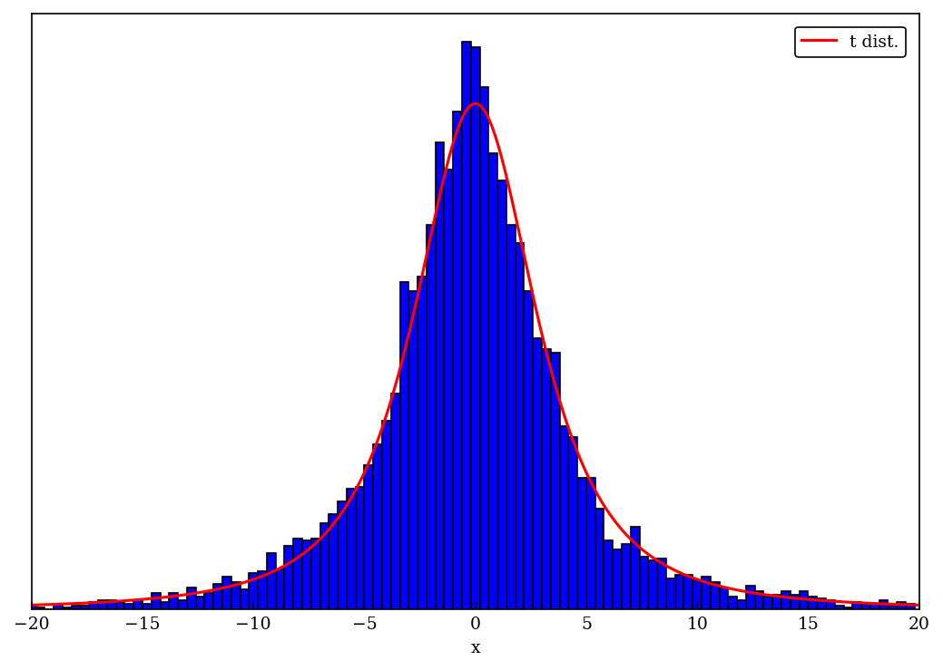
# Plot the t distribution as a bar chart, as we'll use in the movie
x_max = 20
x_t = np.linspace(-x_max, x_max, 500)
fig = plt.figure(figsize=(7,5))
ax1 = fig.add_subplot(1,1,1)
ax1.set_xlabel('x')
ax1.yaxis.set_visible(False)
ax1.set_xlim(-x_max, x_max)
t_label = 't dist.'
t_color = 'red'
n_color = 'green'
t_dist_pts = t_dist.pdf(x_t)
t_dist_max = max(t_dist_pts)
ax1.plot(x_t, t_dist_pts / t_dist_max, label=t_label, color=t_color)
num_bins = 100
delta_bin = 2 * x_max / (num_bins)
hist_pts, bin_edges = np.histogram(norm_scaled_vals, bins=num_bins, range=(-x_max, x_max))
hist_norm = 1 / (np.sum(hist_pts) * delta_bin) # 1 / max(hist_pts)
ax1.bar(bin_edges[:-1], hist_pts * hist_norm / t_dist_max, align = "center", width = np.diff(bin_edges), color='blue', ec='black')
ax1.legend()
fig.tight_layout()
Making a movie of the evolution of the distribution#
We’ll follow the general idea in the blog by Rasumu Baath, with some tweaks.
We’ll play the animation using html5. You can adjust all details of the animation by adjusting the settings below.
def animate(nframe, empty=False):
"""
Draw a new frame every time with the sampled value and the Gaussian pdf
Many global variables here, so this should be refactored!
"""
t_label = "Student's t pdf"
norm_label = 'gaussian pdf'
samp_label = 'sampled pts'
num_bins = 50
point_alpha = 0.2
# prepare a clean and image-filling canvas for each frame
fig = plt.gcf()
fig.clf()
ax1 = fig.add_subplot(1,1,1)
ax1.yaxis.set_visible(False)
ax1.set_xlim(-20, 20)
ax1.set_ylim(-0.1, 1.1)
ax1.set_xlabel(' ')
ax1.axhline(0., color="gray", alpha=0.5)
ax1.set_title("Student's t-distribution from Gaussians")
# These are in unitless percentages of the figure size. (0,0 is bottom left)
max_sigma_vals = max(sigma_vals)
left, bottom, width, height = [0.15, 0.6, 0.2, 0.2]
ax2 = fig.add_axes([left, bottom, width, height])
ax2.set_title(r'$\sigma$ samples')
sigma_max = 15
ax2.set_xlim(0, sigma_max)
ax2.xaxis.set_visible(False)
ax2.yaxis.set_visible(False)
ax2.axhline(0., color="gray", alpha=0.5)
ax2.hist(sigma_vals, bins=num_bins, range=(0,sigma_max), density=True, color=n_color, alpha=0.8)
ax2.axvline(sigma_vals[nframe], color='red')
ax2.set_ylim(bottom=-0.02)
if nframe < frame_switch:
sigma_now = sigma_vals[nframe]
norm_pts = norm.pdf(x_t, loc=norm_loc, scale=sigma_now)
max_norm_pts = max(norm_pts)
scale = 1 / max_norm_pts # t_dist_max / max_norm_pts
ax1.plot(x_t, scale * norm_pts, color=n_color, label=norm_label)
ax1.plot(norm_scaled_vals[:nframe], np.zeros(nframe), '.', color='blue', alpha=point_alpha, label=samp_label)
ax1.plot(norm_scaled_vals[nframe], 0, '.', color='red')
else:
sigma_now = sigma_vals[nframe]
norm_pts = norm.pdf(x_t, loc=norm_loc, scale=sigma_now)
max_norm_pts = max(norm_pts)
scale = 1 / max_norm_pts # t_dist_max / max_norm_pts
index = int(frame_switch + (nframe - frame_switch) * frame_skip)
#ax1.plot(norm_scaled_vals[:index], np.zeros(index), '.', color='blue', alpha=point_alpha, label=samp_label)
# count, bins, ignored = ax1.hist(norm_scaled_vals[:index], range=(-20,20), bins=num_bins, density=False,
# color='blue', alpha=0.4)
hist_pts, bin_edges = np.histogram(norm_scaled_vals[:index], bins=num_bins, range=(-x_max, x_max))
ax1.bar(bin_edges[:-1], hist_pts * hist_norm / t_dist_max, align = "edge", width = np.diff(bin_edges),
color='blue', ec='black', label=samp_label)
if (nframe < nframes - 2):
ax1.plot(x_t, scale * norm_pts, color=n_color, label=norm_label)
ax1.plot(norm_scaled_vals[nframe], 0, '.', color='red')
# Plot the expected t distribution at the end of the animation
if (nframe > nframes - 2):
ax1.plot(x_t, t_dist.pdf(x_t) / t_dist_max, label=t_label, color=t_color)
ax1.legend(loc='upper right')
#fig.tight_layout()
# Settings
# from datetime import date
# today = date.today()
# date_formatted = today.strftime("%d%b%Y")
# gif_filename = 'Student_t_animation_' + date_formatted # filename for gif
width, height = 640, 224 # dimensions of each frame
nframes = 120 # 80 # number of frames
fps = 3 # frames per second
interval = 100
num_bins = 50
delta_bin = 2 * x_max / (num_bins)
frame_switch = 40
frame_skip = N_gamma / 100
index_max = int(frame_switch + (nframes - frame_switch) * frame_skip)
print(f'max index: {index_max}')
hist_pts_all, bin_edges = np.histogram(norm_scaled_vals[:index_max], bins=num_bins, range=(-x_max, x_max))
hist_norm = 1 / (np.sum(hist_pts_all) * delta_bin) # 1 / max(hist_pts)
fig = plt.figure(figsize=(4,3))
anim = animation.FuncAnimation(fig, animate, frames=nframes, repeat=False, blit=False)
HTML(anim.to_jshtml()) # or simply: anim (because of rcParams line above)
# Save as an animated gif
# print('Saving animated gif: ', gif_filename + '.gif')
# anim.save(gif_filename + '.gif', writer='imagemagick', fps=fps)
# saving to mp4 using ffmpeg writer
# print('Saving mp4 video: ', gif_filename + '.mp4')
# writervideo = animation.FFMpegWriter(fps=fps)
# anim.save(gif_filename + '.mp4', writer=writervideo)
max index: 4840